Why I Redesign Product Pages Before Touching the Homepage: A Winning Ecommerce Strategy
Introduction
Most business owners obsess over a beautiful homepage — but sales are closed on product pages. If you want faster ROI from design work, start where buying decisions are actually made.
In this article you’ll learn why product pages deserve priority, the practical steps to redesign them, quick layout tips to lift conversions, and where to go next for help.
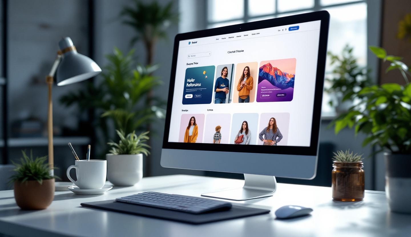
The problem: homepage vanity vs. product page reality
A polished homepage is great for brand impression, but many visitors never see it. Over 70% of ecommerce visitors land directly on product pages from search, ads, or social. That means your single best opportunity to convert traffic often happens off the homepage.
Worse, product pages are common sources of friction: slow images, unclear CTAs, buried shipping info, or weak social proof. Fixing those issues usually produces measurable sales gains faster than a homepage refresh.
Why redesign product pages first (short, compelling reasons)
Redesigning product pages before the homepage gives you immediate business impact. Key reasons:
- Direct impact on revenue — small improvements here scale to purchases.
- Better ROI — changes affect the pages actually getting traffic and conversions.
- Rich analytics — add-to-cart and conversion metrics tell you what works.
- Faster testing cycles — product pages are easier to A/B test than full-site templates.
- Prepares scalable growth — once product pages convert, you can confidently drive more traffic.
Practical steps to redesign product pages
Follow this five-step sequence to get results without overcomplicating things:
- Audit pages and traffic: Identify high-traffic, high-exit, and low-conversion items using analytics.
- Define goals and KPIs: Decide whether you want higher conversion rate, higher AOV, lower returns, or better SEO.
- Apply best practices: Improve images, copy, CTAs, and trust elements (details below).
- Optimize UX: Make shipping, returns, stock, and support information easy to find; prioritize mobile.
- Test and iterate: Use A/B tests, heatmaps, and session recordings to validate changes.
Each step should be measurable. Aim for one change at a time so you can see its true effect.
Product page layout tips that actually convert
Small layout choices have big effects. Use these simple rules:
- Above-the-fold: Show a product image, price, key benefit, and the Add to Cart button without scrolling.
- Use high-quality images: Offer multiple angles and zoom; include lifestyle shots to show scale and use.
- Prominent CTAs: Make buttons sticky on mobile so they’re always available.
- Social proof: Feature ratings, reviews, and recent purchases near the CTA.
- Clear logistics: Display shipping cost/estimates, returns policy, and stock level up front.
These are low-effort, high-impact changes you can implement quickly.
Example: before-and-after that moved the needle
A mid-sized electronics store had great homepage engagement but poor product page conversions. We redesigned the product page to include larger images, simplified copy, sticky CTAs, and faster mobile loading. Result: a 32% jump in conversion rate within weeks — before touching the homepage.
The lesson: improving the pages where visitors decide to buy delivers measurable revenue faster than redesigning brand pages.
Trends to watch (quick overview)
- AI personalization: Dynamically surface the right images, descriptions, or offers based on user behavior.
- Interactive visuals: 360° views, AR previews, and short demo videos reduce product uncertainty.
- Performance focus: Google’s Core Web Vitals look at page speed and stability — faster pages help both SEO and conversions.
- Trust signals: Real-time purchase notifications and user-generated content increase credibility.
- Mobile-first design: With most traffic on phones, mobile UX is no longer optional.
Actionable checklist (5 quick items)
- Audit top 20 product pages for traffic and conversion.
- Replace at least one low-quality image per product with a high-resolution or lifestyle photo.
- Add or make sticky the primary CTA on mobile.
- Display shipping/return and stock status clearly.
- Run a simple A/B test on headline or CTA for two weeks.
Conclusion
If you want faster wins from your website redesign, start with product pages. They’re where buying decisions happen and where small changes produce big results. Improve images, CTAs, mobile UX, and trust signals — then measure and iterate.
Want help or examples? Visit https://prateeksha.com to see our services, check out our insights at https://prateeksha.com/blog, or read the full breakdown at https://prateeksha.com/blog/why-redesign-product-pages-before-homepage. If you’d rather delegate the work, reach out and get a targeted product-page audit so your next redesign drives real revenue.


Comments